Portuguese Fertility Association has a mission to help people on their journey to parenthood since 2006.
- Non-Profit
- Health
- Interaction Design & Development
- Branding & Visual Identity


Project details
Starting Point
Since 2006, APF (Portuguese Fertility Association) has been a key resource for people navigating the challenges of fertility and parenthood in Portugal. But the brand had not kept pace with the organisation's mission. The communication was disconnected and the visual identity felt too institutional, leaving out the very families and younger generations the association exists to support.
Solution & Impact
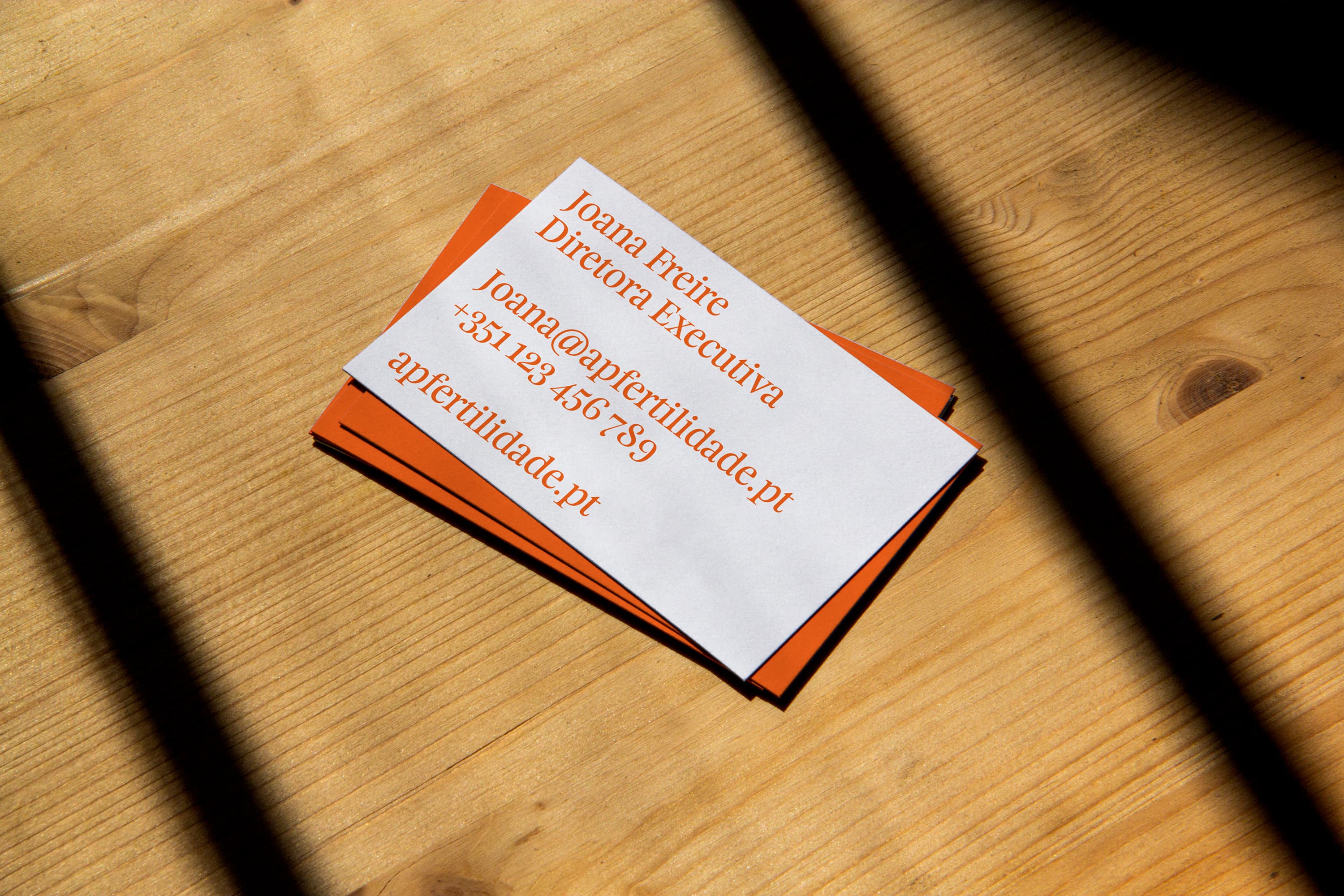
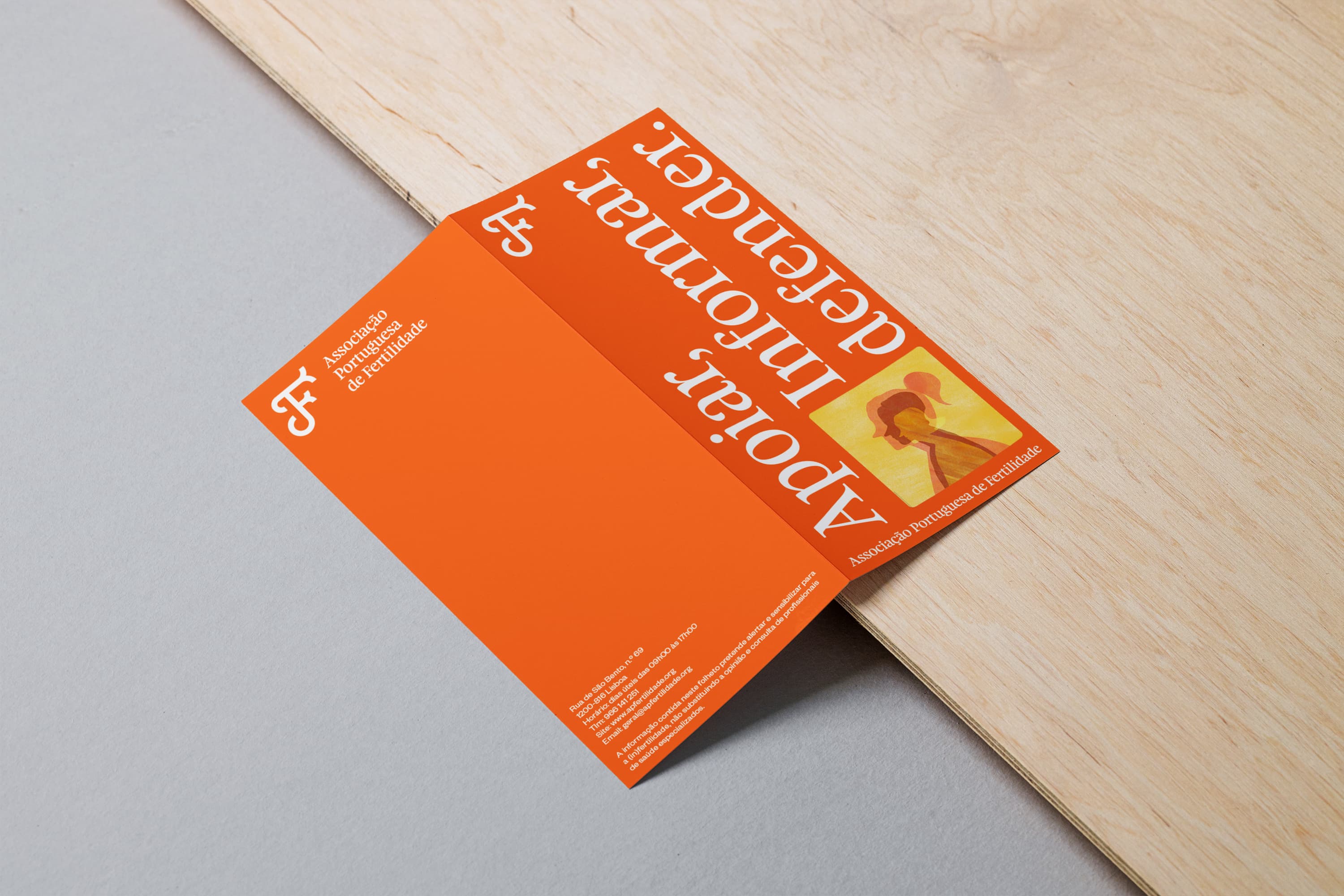
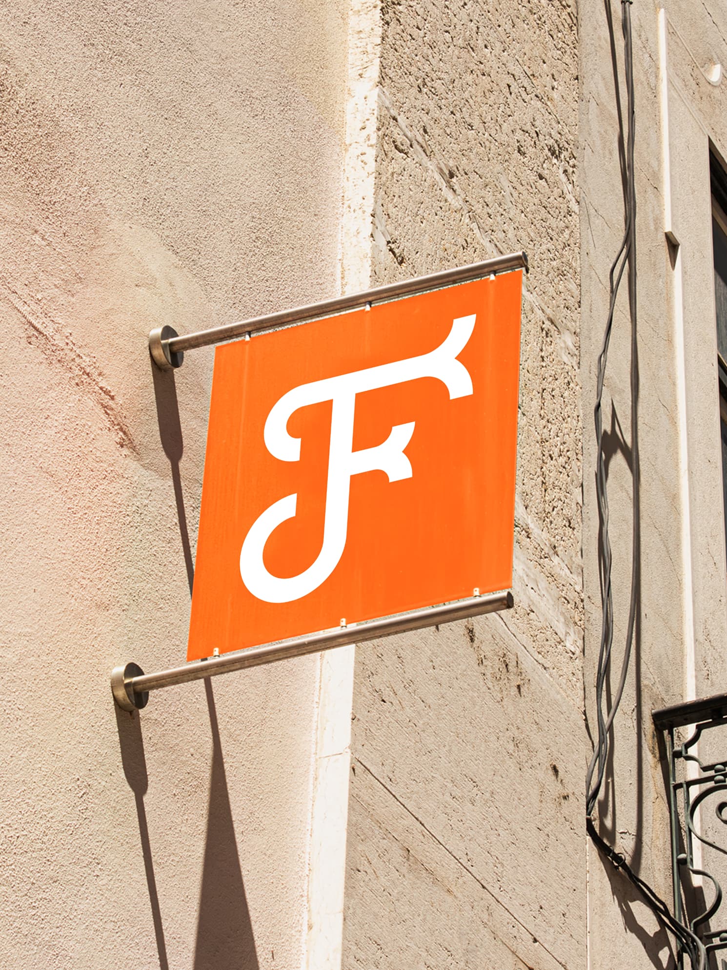
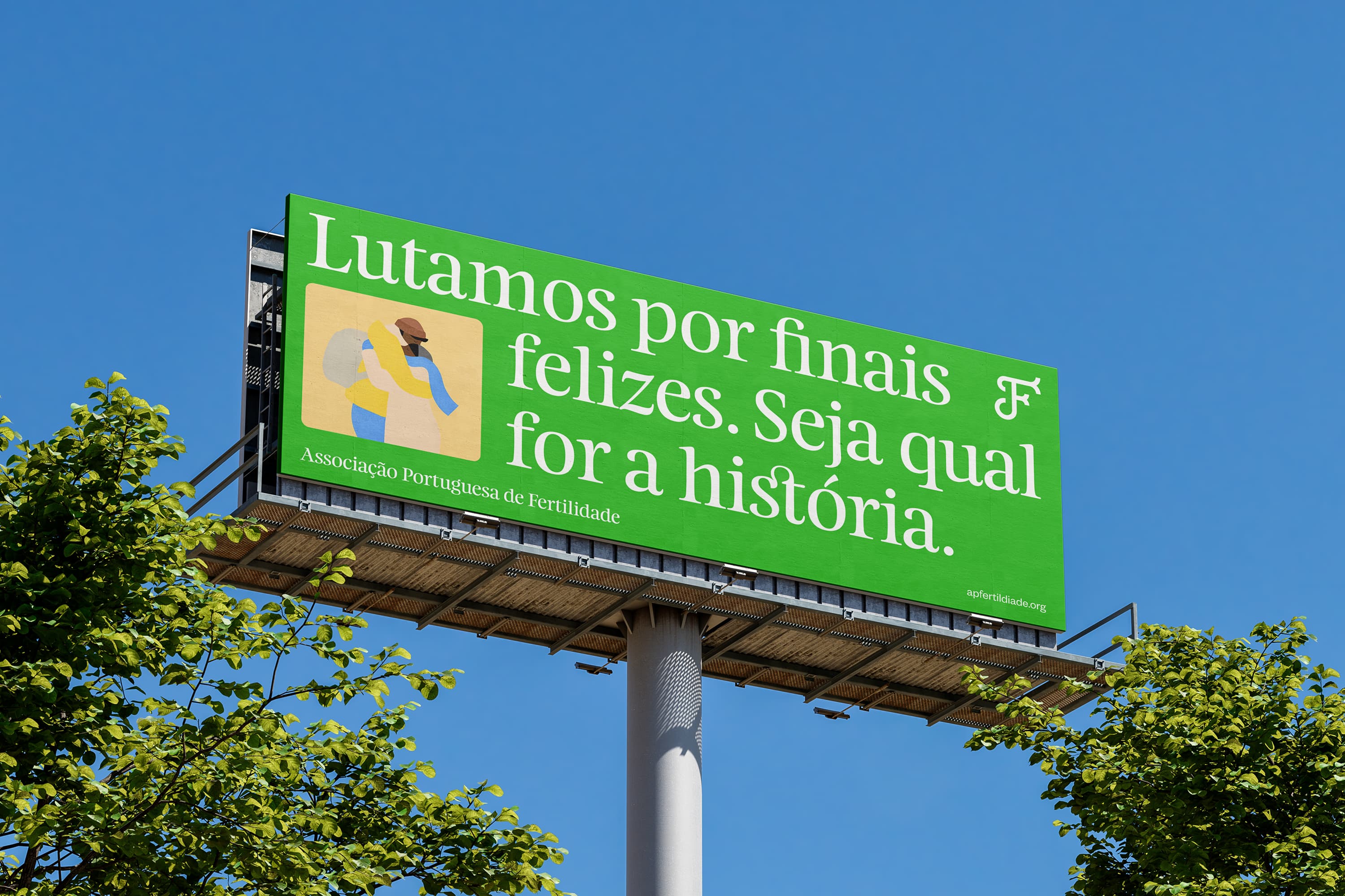
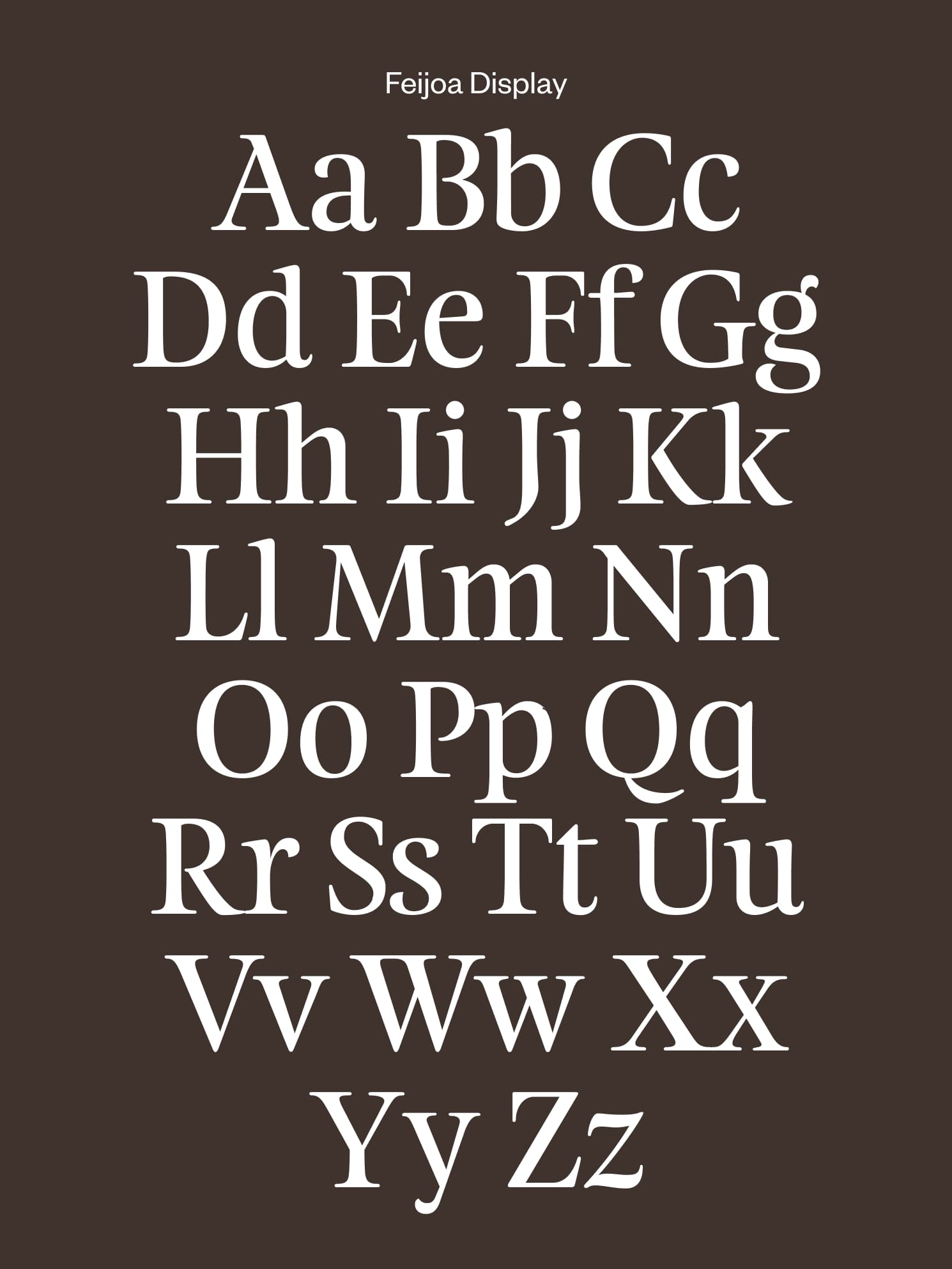
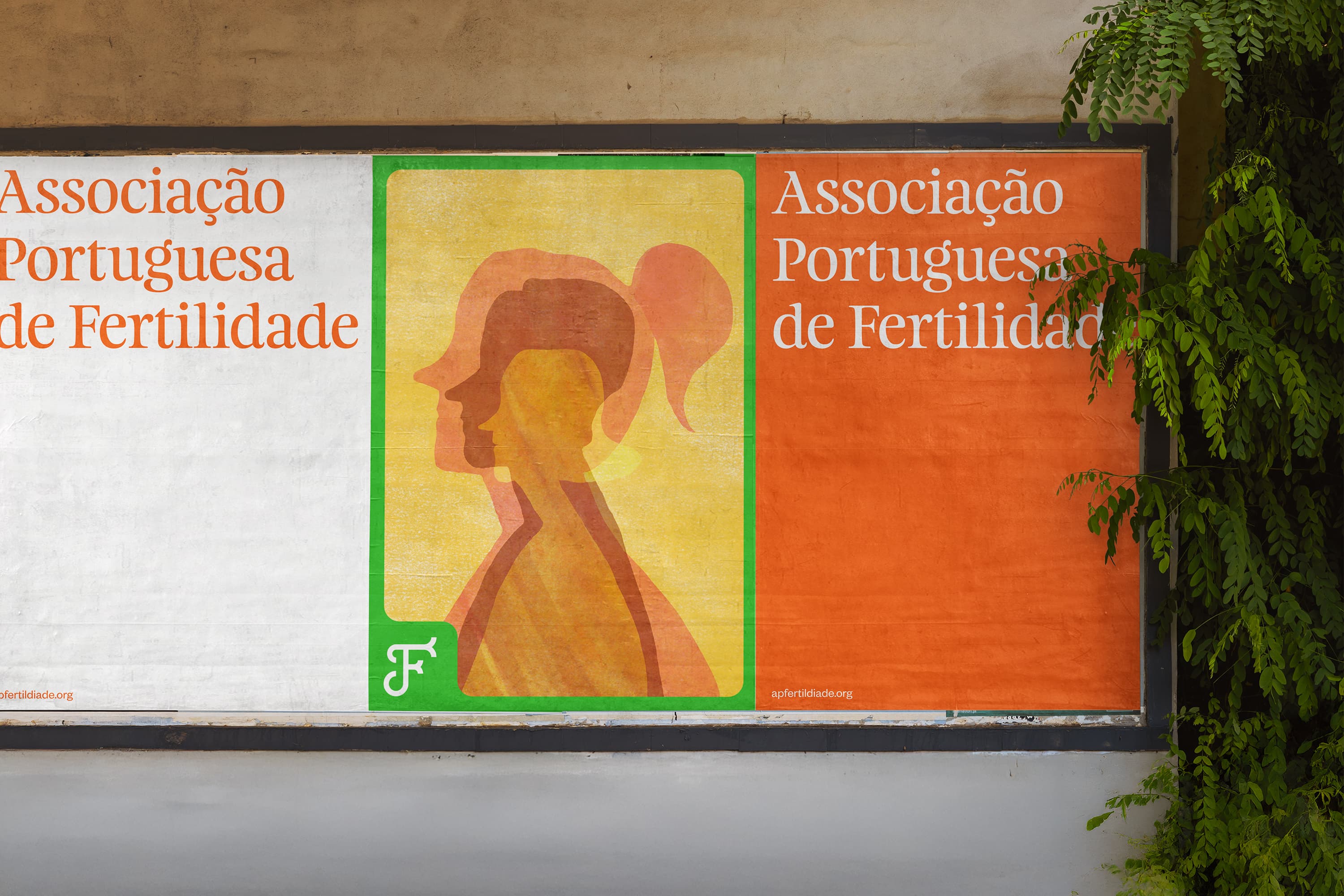
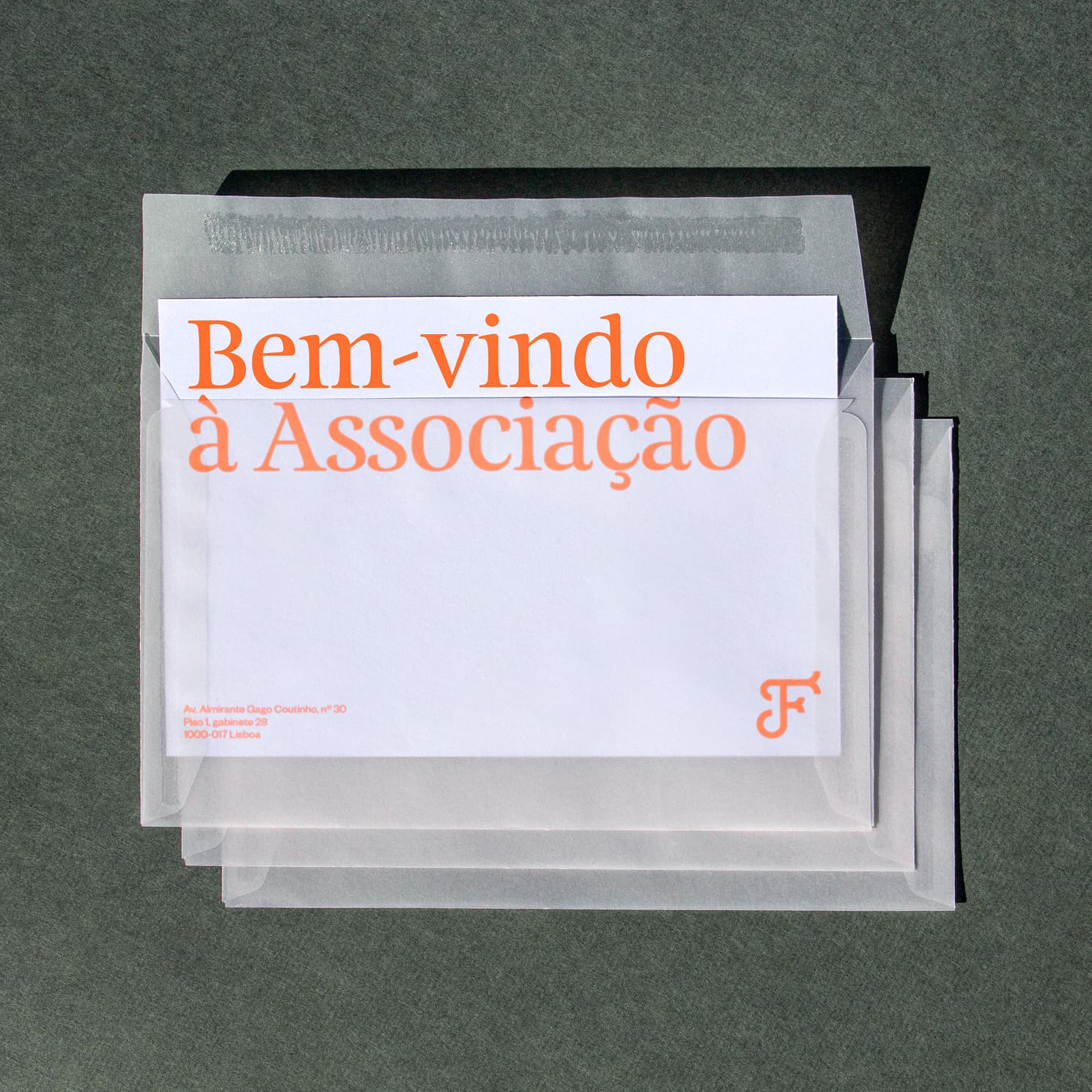
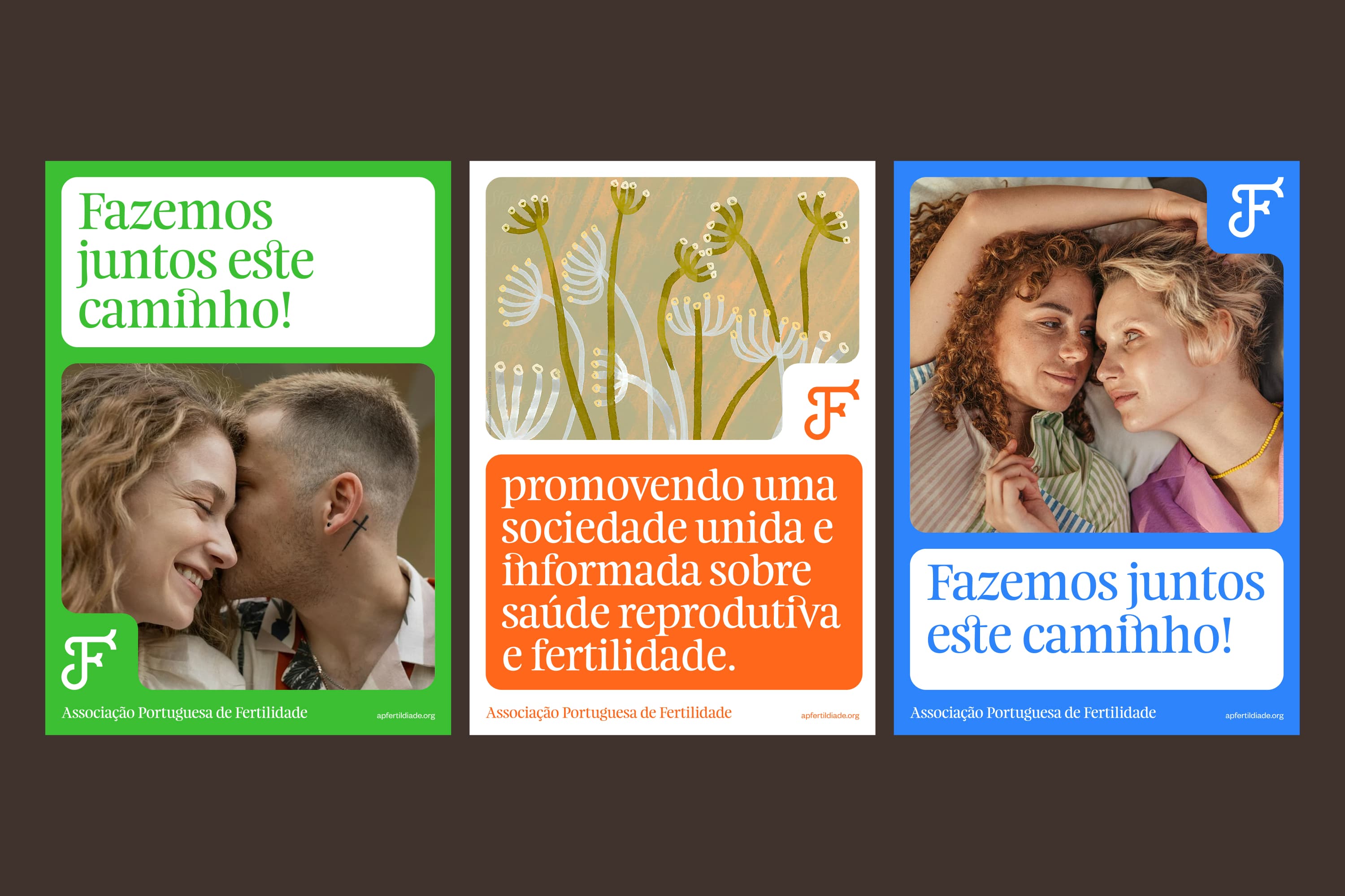
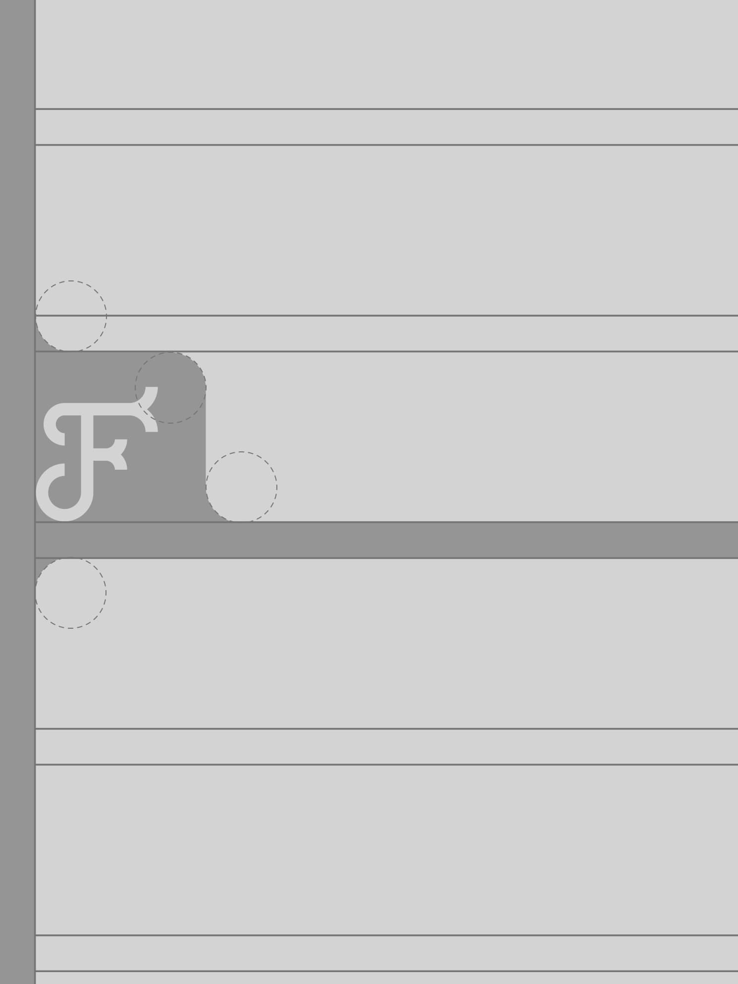
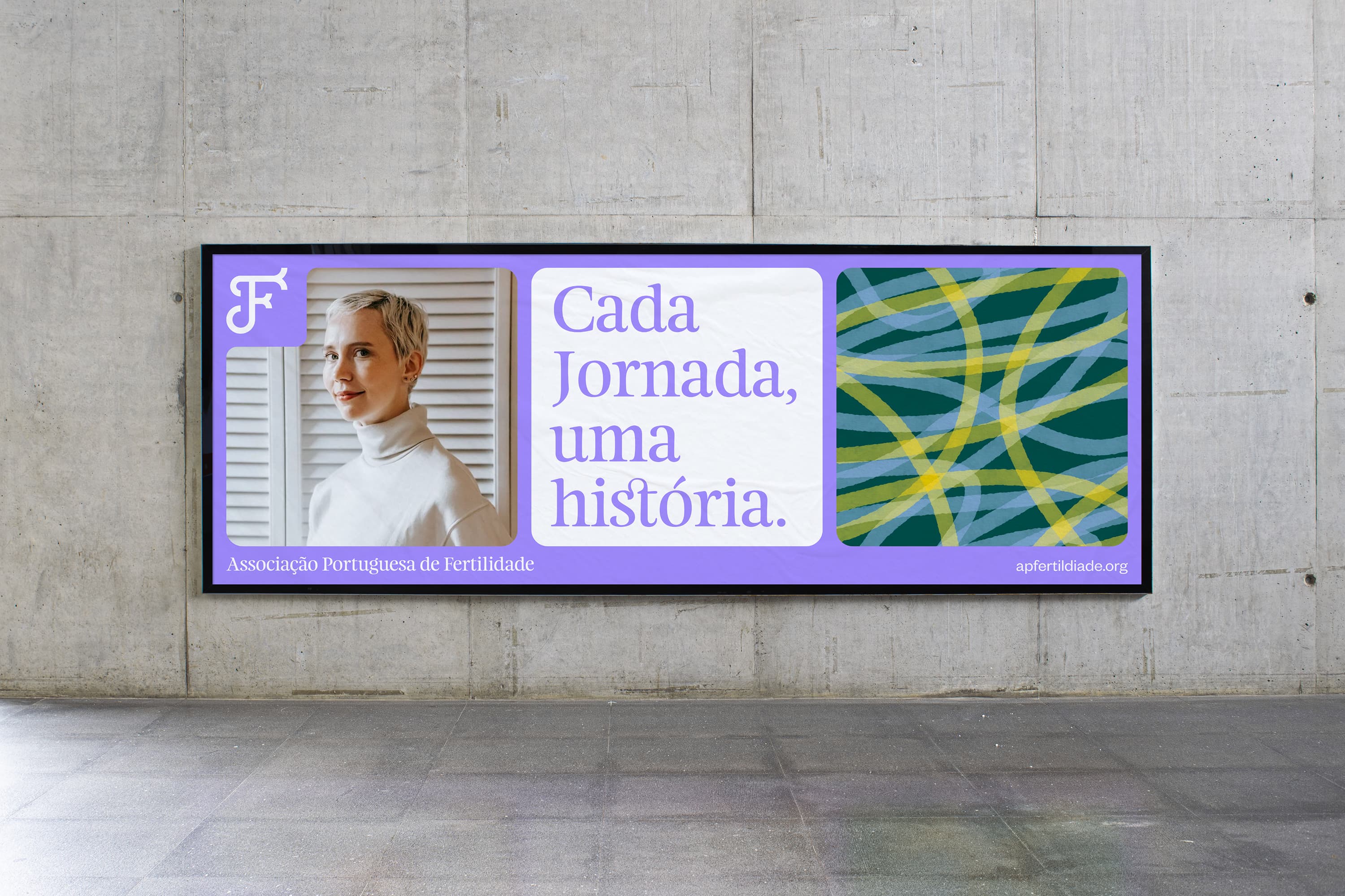
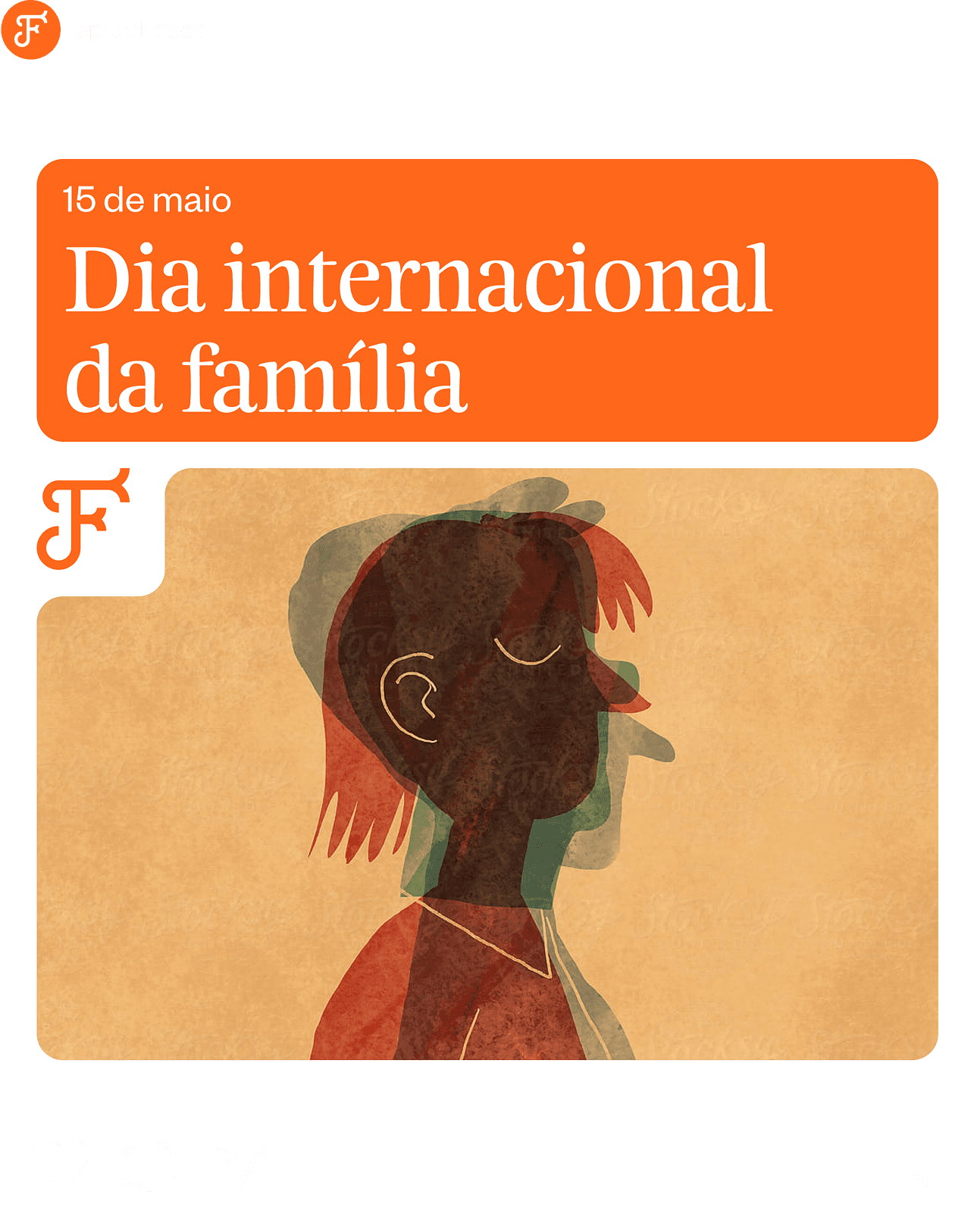
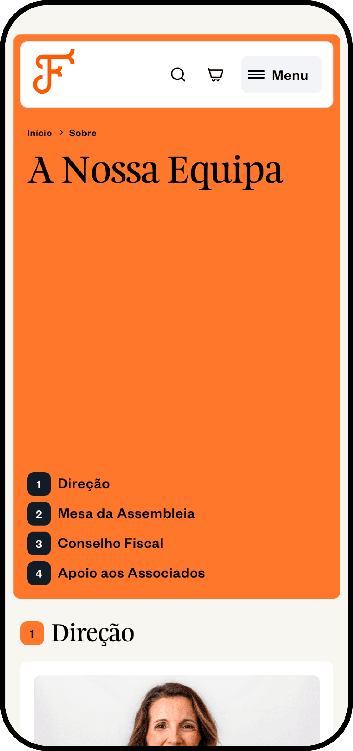
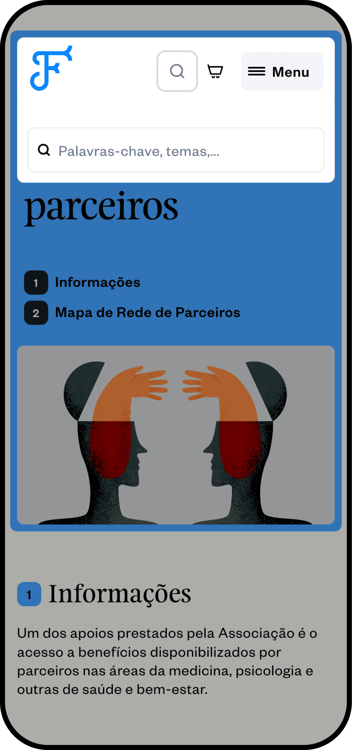
The logo was designed to reflect the many paths towards fertility: each journey is personal and unique, and the identity needed to make that legible at a glance. We chose a bright and lively colour palette to help alleviate the emotional weight that often accompanies conversations about fertility and sexual health. We built a complete set of brand guidelines with construction rules to ensure consistent communication across every platform and channel.
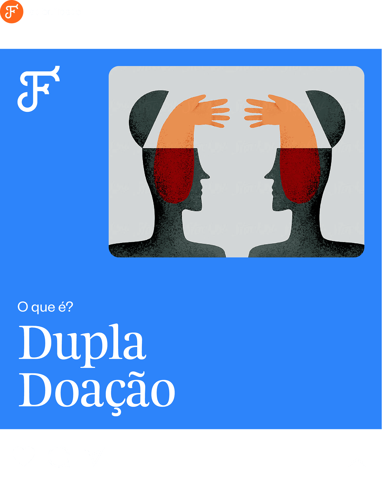
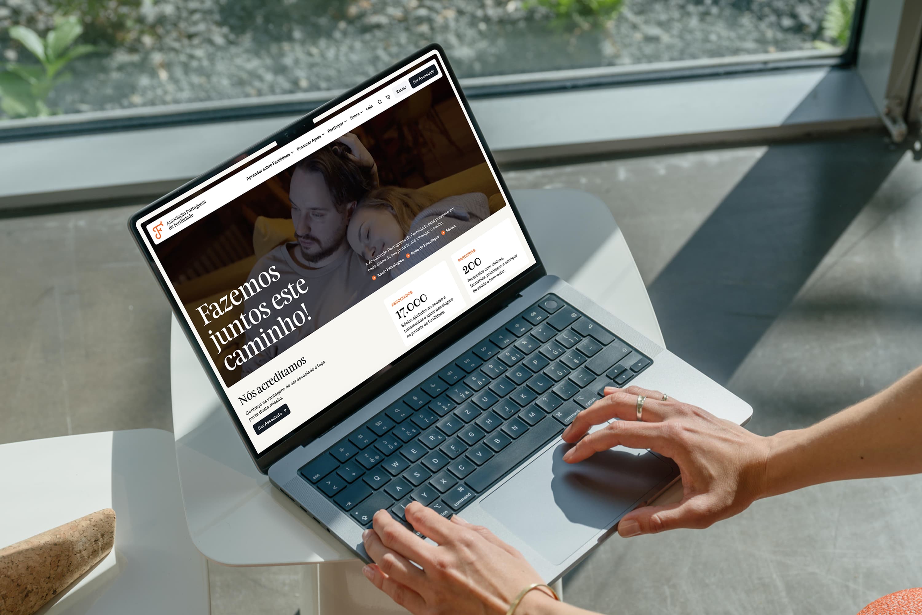
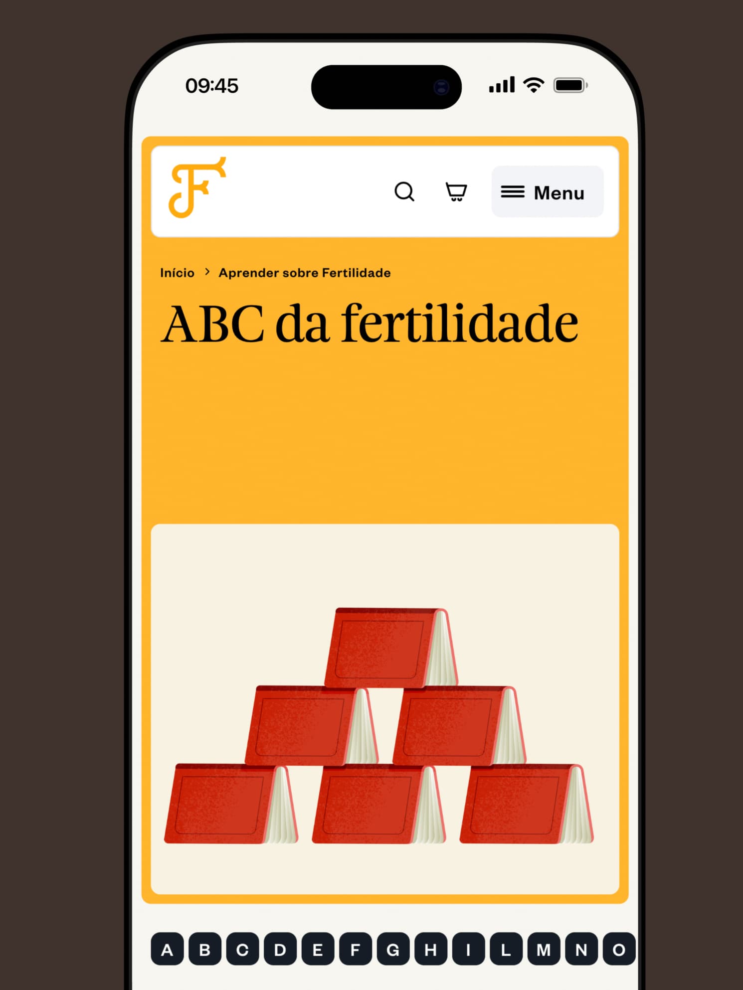
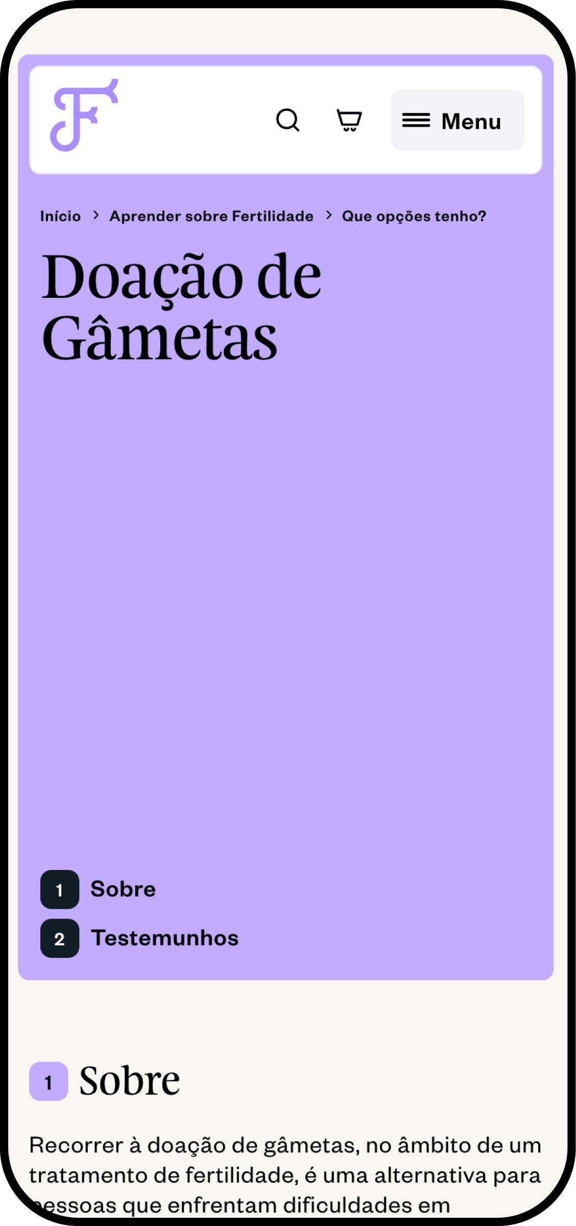
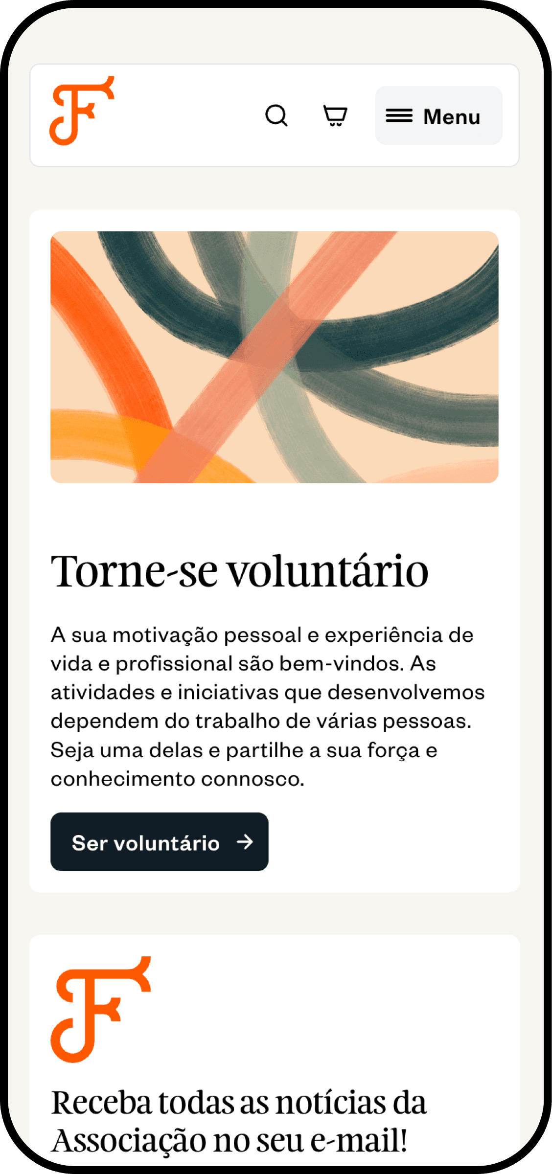
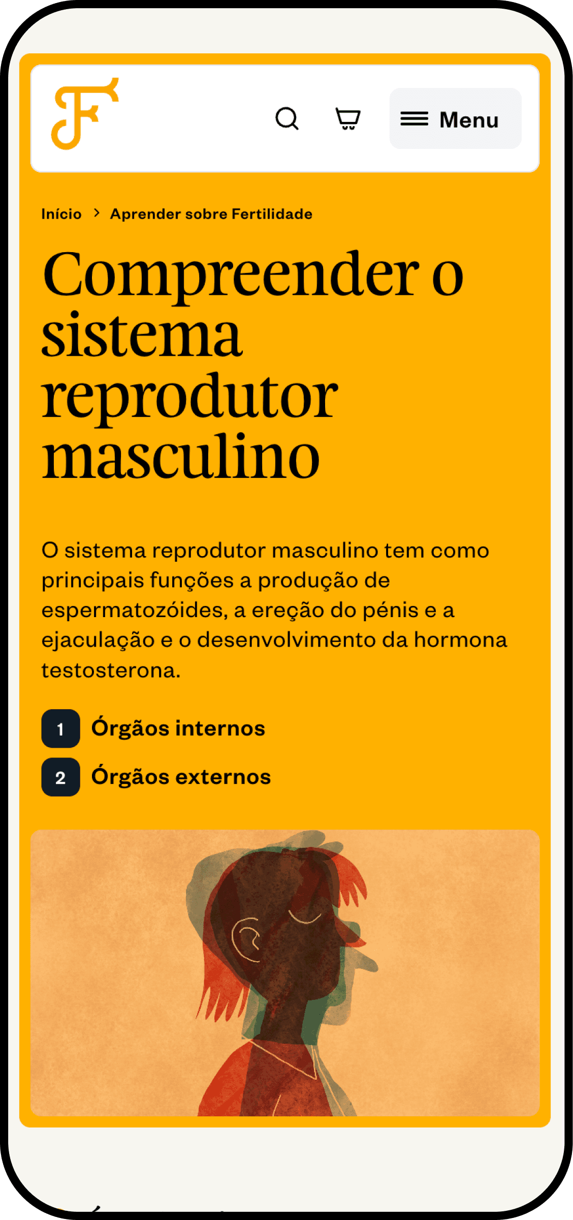
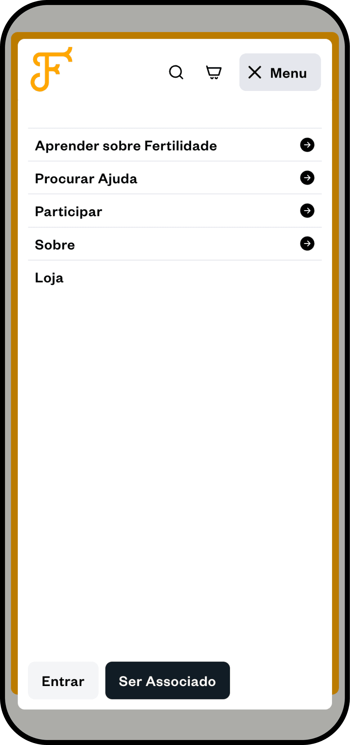
The digital strategy focused on two things: communicating APF's values clearly, and building a platform where people could learn and connect. The website includes an online forum for community participation, a shop for books on fertility and sexual health, and a membership system that allows users to register, pay and renew entirely online. An inclusive tone runs through everything.
Credits
João Simões
João Simões, Felipe Regis
Felipe Regis
Felipe Regis
Beatriz Sapata, João Sousa
Beatriz Sapata, Miguel Miranda